Reading a price chart starts with a few concrete questions: what prices were recorded, where did the move pause, and what happened after that pause? You need to recognise the prices in each bar, the period it covers and the boundaries of the movement you are examining.
A chart cannot tell you the next candle in advance. Use it to describe what has happened and choose what you would need to see next before considering a trade. That makes the idea checkable: price can support it, fail to confirm it or contradict it.
What a price chart shows
Time usually runs along the horizontal axis and price along the vertical axis. Before drawing anything, check the instrument, quote currency, data provider and chart interval. A dollar-priced share, a futures contract and a currency pair can produce similar shapes without being the same product or offering the same trading conditions.
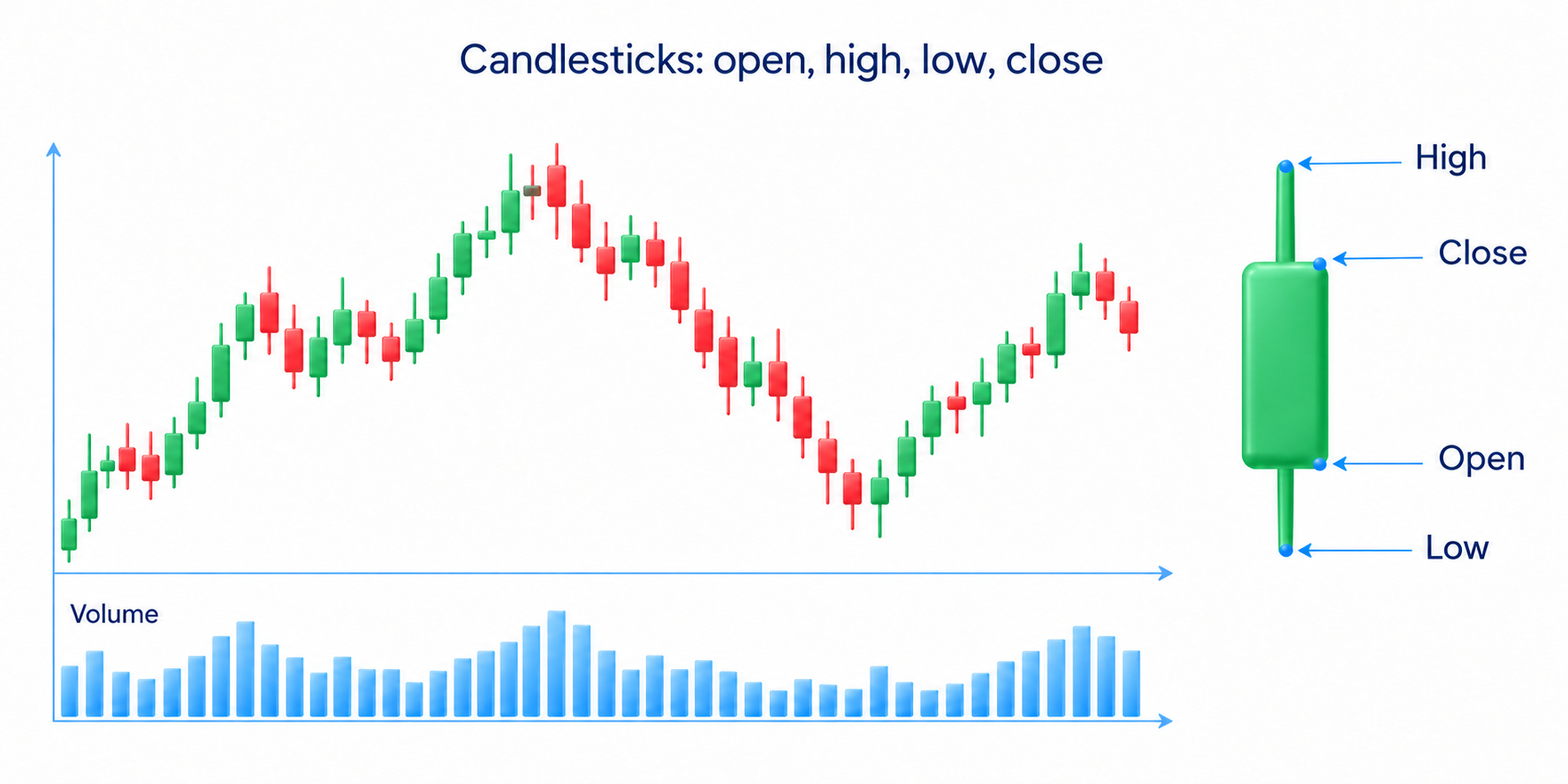
An ordinary time-based bar or candlestick summarises four prices: open, high, low and close. You may see them labelled O, H, L and C. While the bar is forming, its displayed close is the latest available price; the high and low can still change. Use a completed bar when your rule requires a final closing price.
Those four values do not reveal the full sequence within the period. Price could reach the high before the low, or the low before the high, and leave the same completed bar. You cannot reconstruct every trade, the order of both extremes or the identity of participants from its shape alone.
Technical analysis studies price and available trading data to assess direction, important areas and possible trade conditions. The idea that prices reflect information is a premise of the method, not proof that all news has already been absorbed. Unexpected events and new decisions can change the market after you finish your analysis.
Line charts, bars and candlesticks
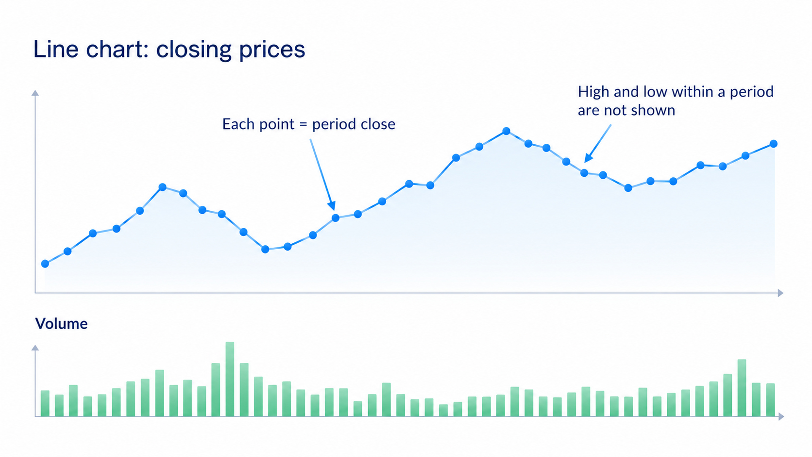
A line chart usually joins successive closing prices. That makes the broad movement easy to follow, but hides the highs and lows within each period. Check the selected input: some platforms can draw the line from opens, highs, lows or averages instead. The line is only a summary of the data you chose.
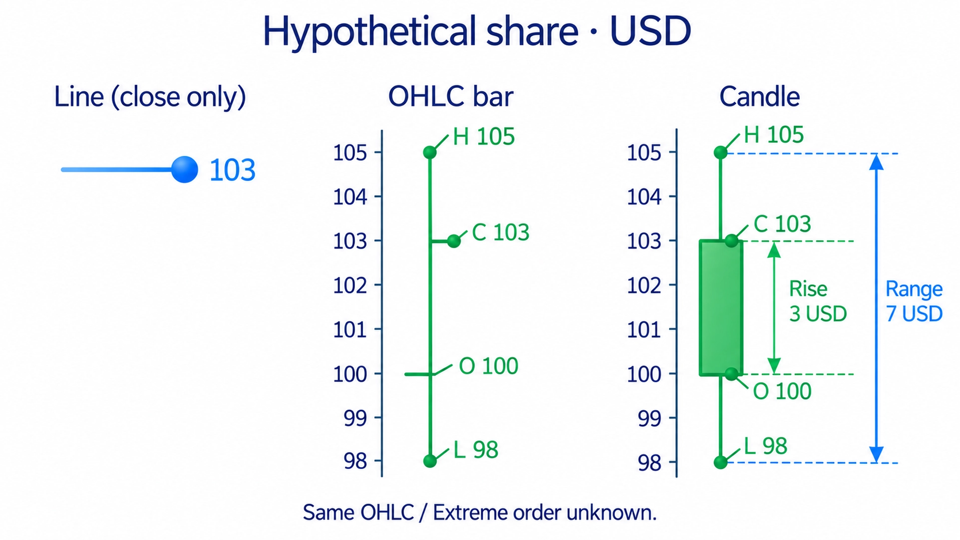
A standard OHLC bar uses a vertical line for the low-to-high range, a left-hand tick for the open and a right-hand tick for the close. An ordinary candlestick shows the same values: its rectangular body connects the open and close, and its thin wicks extend to the high and low. HLC bars omit the opening mark.
Candle colours are settings, not universal facts. Green commonly means a close above the open and red a close below it, but platforms can use other colours or compare with the previous close. Check which convention is active. A green body does not mean there were more individual buyers than sellers; an executed trade has both sides.
Consider a hypothetical share priced in dollars: open $100, high $105, low $98 and close $103. The move from open to close is a $3 rise; the full high-to-low range is $7. A close-based line would retain $103. The ordinary bar and candle retain all four prices, although neither tells you which extreme came first.
None of those values alone is a buy signal. The same candle can appear near a boundary, inside a range or after a long move. Its meaning depends on that location and the next price reaction. Candlestick patterns explain recurring arrangements of bodies and wicks separately; learn the underlying prices before assigning a name to the shape.
For an initial reading exercise, use ordinary bars or candles built from market prices. Heikin Ashi candles use calculated values to smooth the display. A body edge on that chart need not be a price at which your order could trade. Check actual quotes before using a synthetic candle as an entry or exit reference.
What is a timeframe?
A timeframe specifies the period summarised by a time-based bar. M15 means 15 minutes, H1 an hour and D1 a trading day. The day's contents depend on the instrument and session settings; a daily share candle does not necessarily represent 24 uninterrupted hours of trading. The interval is also different from the total history visible on screen.
A daily candle combines many intraday movements. An hourly chart separates some of them into smaller pieces. The daily view can be rising while the hourly view is falling because the smaller decline sits inside a larger upward move. Different intervals are views of the data, not separate markets contradicting each other.
For a first exercise, you could use a daily chart for the broad movement and an hourly chart for detail. Larger intervals leave more time between completed bars. That does not guarantee a better signal or smaller loss. Choose intervals that fit when you can observe the market and the conditions your trading rules require.
Start with the broad view, mark the direction and nearby boundaries, then locate the smaller movement within it. A higher timeframe does not mechanically control a lower one. Its practical value is context: a short decline need not be a reversal of the larger rise. Keep the same instrument when switching views.
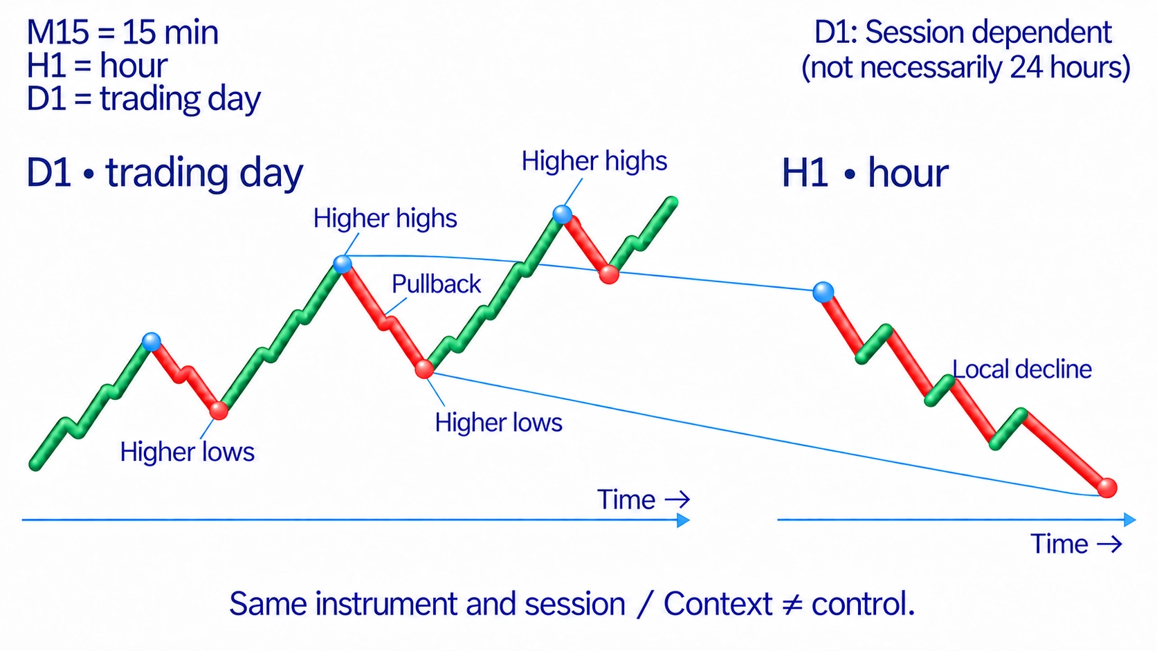
Save the data source and trading-session settings with your drawings. Including or excluding extended hours, or switching feeds, can change the highs, lows and candle shapes. Comparisons need the same instrument and construction settings, not just similar names. Otherwise a changed drawing may reflect changed data rather than a new market event.
Trends, ranges, impulses and pullbacks
An uptrend is commonly described by a sequence of higher significant highs and higher significant lows. A downtrend has lower highs and lows. A range is movement between boundaries without sustained progress in one direction. These descriptions apply to the chosen scale, and the transition between them may be unclear rather than immediately classifiable.
An impulse advances the main movement being examined. A pullback moves against it and gives back part of that advance. Identify the larger wave before labelling its parts. One red candle is not automatically a pullback, and a multi-bar impulse can include candles of both colours. Direction relative to the wave matters more than a single body colour.
Mark the visible peaks and troughs, then compare their order. In a rising structure, failure to reach a new high followed by a move below a significant earlier low gives you a reason to check whether the rise is weakening. A brief move below that low still does not establish a lasting downtrend. Look at the return and subsequent movement.
In my approach, a sideways area is described as balance and a directional move as imbalance. This helps organise the observation: reaction around a boundary or continuation of a wave. A range by itself does not prove that a large participant is accumulating a position. The slope of the chart also does not identify who bought or sold.
How to draw support and resistance
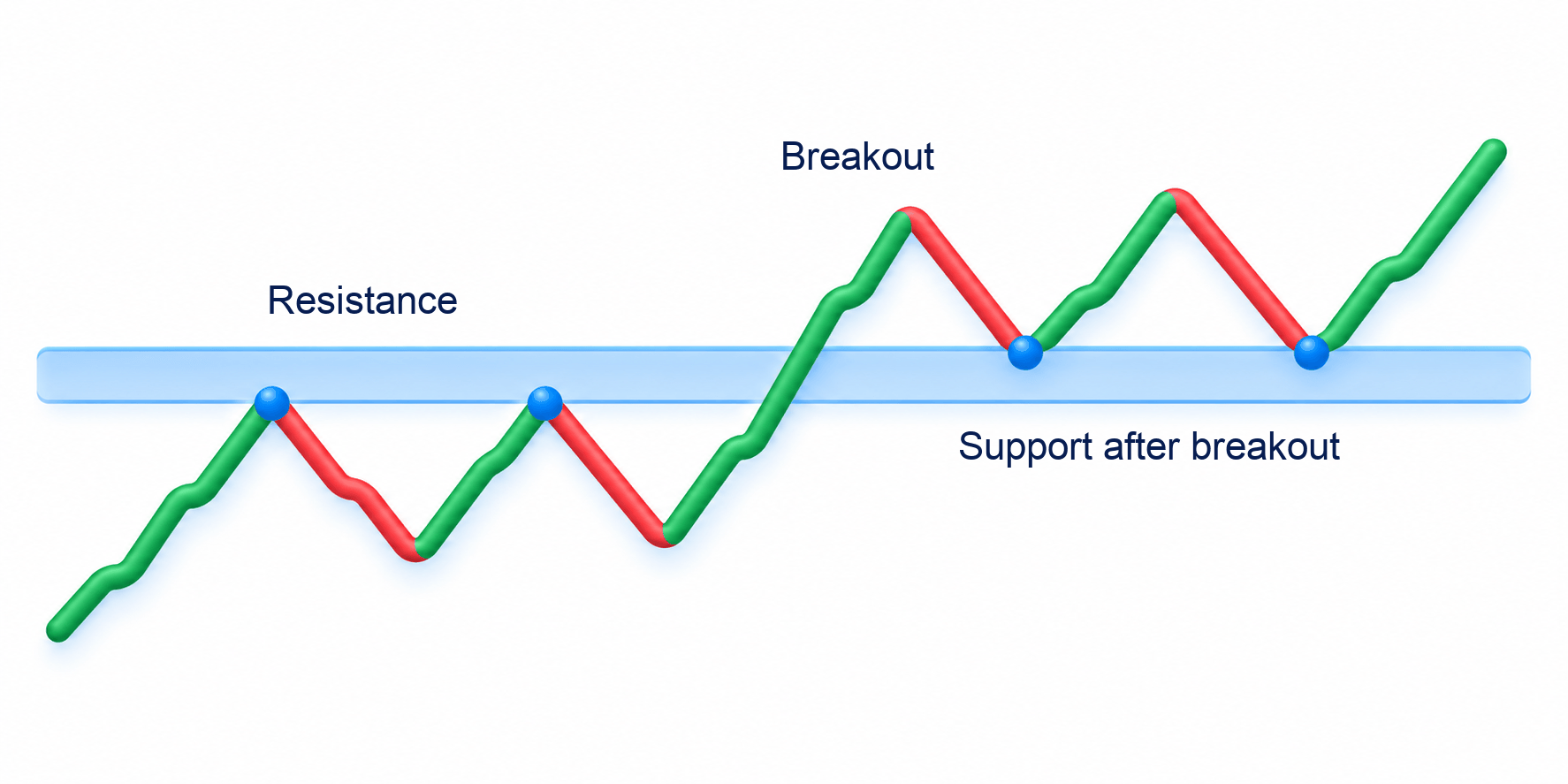
Support is an area where a decline previously paused or turned upward. Resistance is an area where a rise paused or turned downward. They record past reactions and give you a place to examine the next approach. They are not promises that price will reverse again, nor maps of every order currently waiting in the market.
Find noticeable turning points and check whether their prices cluster. When nearby lows differ, mark the area between them rather than forcing one exact line through a convenient point. In my level analysis, the strength of the departure also matters: how sharply price changed direction after reaching the area. That is an observation to compare, not a guarantee for the next visit.
Set the zone before the next test and state what would justify revising it. Do not widen it every time price crosses the boundary. Repeated touches make an area visible, but do not guarantee increasing strength; the orders available there can change. An approach that looked familiar can end in a break instead of another reversal.
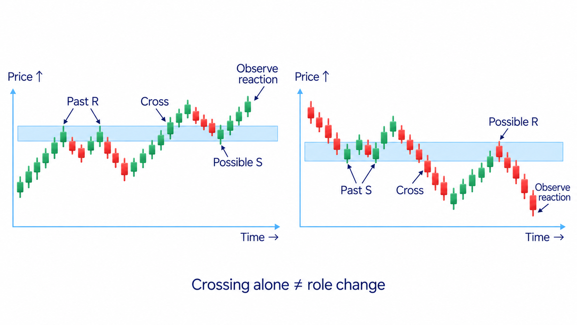
After price moves above resistance, the old area may act as support on a return. A broken support area may become resistance from below. Check the actual reaction on the other side rather than relabelling the zone automatically after one candle. This return to a previously crossed boundary is called a retest; it need not occur on every break.
Trading from one level to another uses one meaningful area as a possible entry location and the next as a possible target. Before the trade, define the reaction that would support the entry and the movement that would invalidate it. If price keeps moving through the zone without that reaction, the drawing alone is no reason to enter.
Moving beyond a boundary and remaining outside differs from briefly crossing it and returning inside. Higher volume is not an exclusive sign of a successful break; a failed attempt can also involve heavy trading. The breakout strategy explains how to examine a break, return and subsequent reaction. Here, the first task is to identify what price actually did relative to your marked area.
How to draw a price channel
A price channel places two roughly parallel boundaries around a movement. It may slope upward, slope downward or run horizontally. The drawing helps you locate waves relative to those boundaries. It does not cause price to move, and price is not obliged to travel from one side to the other.
For a rising channel, connect two noticeable lows separated in time, with the second above the first. Draw a parallel boundary through a suitable high. For a falling channel, connect two declining highs and place the parallel through a low. Use a consistent rule for choosing points instead of selecting whichever ones make the neatest picture.
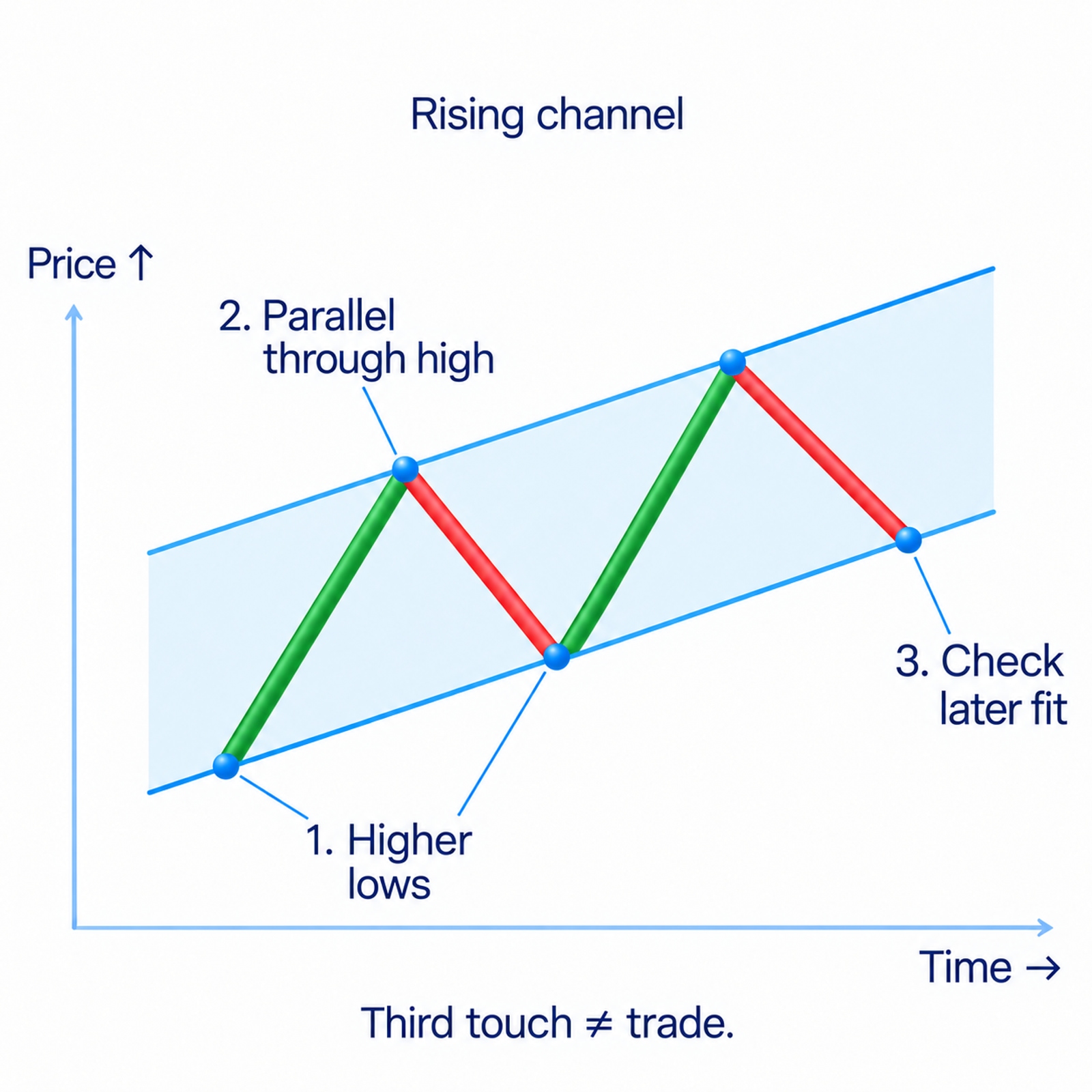
A later reaction near a boundary helps test whether the drawing still describes the movement. Two points let you draw a line; a third touch does not guarantee a profitable trade. If later peaks and troughs do not fit the chosen slope, discard or formally revise the channel. Do not quietly reposition it after every new bar.
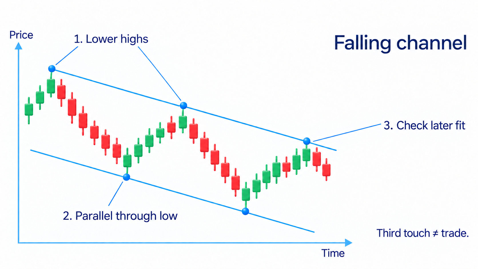
Keep the price scale recorded as well. A linear scale gives equal vertical distances to equal dollar changes; a logarithmic scale gives equal distances to equal price ratios, such as the same percentage increase. Trendline angles can differ between them over a large price change. A channel break is a reason to reassess the highs and lows, not automatic proof of reversal.
How to practise reading a chart
Trading volume measures how much of an instrument traded during a period, such as shares or contracts. Compare that activity with the distance price covered and what happened afterward. High activity with little progress asks a different question from high activity followed by continued movement. Volume analysis explains those comparisons in depth; the chart still supplies the location and sequence.
Volume does not name the fund behind a transaction or prove the next market direction. Tick volume on a currency feed counts quote updates, while a crypto exchange's volume describes its own trading. Establish what the series measures and keep the source and interval consistent when comparing waves. Otherwise the apparent change can come from the data selection.
In my approach, a chart pattern does not replace checking the level and reaction. A flag or double top can form in different locations and market conditions. There is no single success probability for every drawing regardless of its rules. Chart patterns have their own material; use the shape as something to examine rather than a completed decision.
Once you can read the underlying prices, you can study ways to calculate summaries from them. The technical indicators guide introduces routes such as moving averages, MACD and RSI. Their detailed rules belong to their own articles. You do not need extra calculated lines to complete the first exercise of reading bars, waves and boundaries.
Further library articles cover ADX, Bollinger Bands, Ichimoku and VWAP. Open them with a specific question about the chosen tool instead of putting every indicator on the chart. Preserving a readable view makes it easier to compare the prices with your original drawing and notice when the expected reaction did not happen.
Automated drawings, including AI in trading, still need the same checks. Compare their boundaries with the source prices and the rules used to select points. A convenient output does not establish a valid trade. If you cannot explain why the tool chose a zone, treat the mark as a suggestion to inspect, not an instruction to buy or sell.
The course's working-with-levels section uses a Euro futures example. A large rising bar is followed by rising bars with progressively smaller ranges, then a downward break through local supports. I examine the whole sequence: location, reduced progress and the following price reaction. The first large candle alone does not tell you how the movement will finish.
The video on drawing support and resistance uses EUR/USD to demonstrate reaction areas. A drawing identifies where to inspect the next move. It cannot reveal every waiting order or guarantee a bounce. You can follow the written steps above without watching the video; the example is an optional demonstration of the same task.
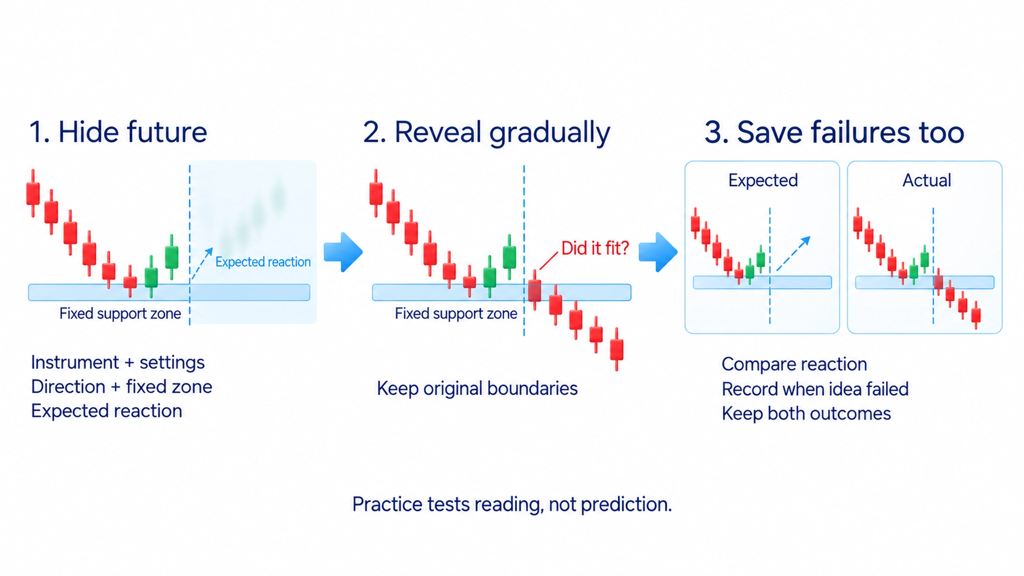
For practice, hide future bars. Record the instrument and settings, the direction being examined, nearby levels and the reaction you expect. Reveal the chart gradually and compare: did the reaction occur, when did the idea stop fitting, and did you move the boundaries afterward? Save the failures as well as the successful-looking cases so that the exercise tests your reading rather than selects attractive pictures.
Frequently asked questions
Technical analysis studies price and available trading data to assess direction, significant areas and possible trade conditions. It supports a checkable idea, not a guarantee of the next movement.
A standard OHLC bar and an ordinary candlestick show the same open, high, low and close. The bar uses ticks; the candle uses a body and wicks. An HLC bar is a different display that omits the opening price.
It is the period covered by one time-based bar or candle. H1 means an hour and D1 a trading day. The contents of the daily period depend on the instrument's session settings.
A larger interval shows the broad move and boundaries; a smaller interval shows detail within them. A local decline may be a pullback in a larger rise. One interval does not mechanically control another.
Past reactions can occur at nearby but different prices. A zone groups those observations. Mark its boundaries before the next test, then inspect the actual reaction rather than assuming another bounce.
It is an area between roughly parallel movement boundaries. A rising channel is drawn from higher lows; a falling channel from lower highs. Crossing a boundary calls for checking the wider structure rather than automatically declaring a reversal.
About the author
Igor Arapov, a practising trader since 2013 and author of the ArapovTrade library. ORCID: 0009-0003-0430-778X.